Best overall: distressed graphics. Best for an immediate statement: oversized front prints. Best for layered outfits: back graphics. This 2026 guide ranks graphic treatments rather than individual products, helping you choose streetwear tees by artwork, placement, fit and outfit balance.
- For best streetwear graphic tees bold prints searches, start with distressed graphics and choose placement around your outfits.
- Boundus shoppers should choose streetwear graphic tees by artwork and fit together, not the graphic alone.
- Oversized front prints suit visible statement outfits; back graphics need an uncovered back to do their job.
- Check garment measurements, fabric details and close-up images before choosing a size or graphic treatment.
Why this matters
A bold graphic can look right on its own and wrong once you add a jacket. Placement, shirt length and the surrounding clothes determine how much of the design you actually see. Choose the outfit role before you choose the artwork.
When browsing Boundus, separate what attracts you from what you need to verify. Distressed artwork, physical holes, a faded appearance and a relaxed silhouette are different features. One does not establish the others.
For your 2026 shortlist, use a simple rule: a statement tee should work in clothes you already wear. An interesting print is not enough if its placement disappears under your usual layer or its hem interrupts your preferred proportions.
What makes the best bold-print graphic tee?
Use these criteria before comparing the ranked options. They apply whether you want an isolated chest graphic or artwork that dominates the shirt.
- Graphic hierarchy: Decide what you notice first. A clear focal point makes an elaborate design easier to style without requiring a plain graphic.
- Print placement: Check where the artwork sits relative to the neckline, side seams and hem. Consider what a jacket covers.
- Distressing: Separate wear effects within the artwork from distressing in the garment itself. Inspect each independently.
- Fit: Compare garment measurements with a tee you like. A size label alone does not describe width, length or shoulder placement.
- Fabric details: Read the stated composition and weight when provided. Do not infer either from a dark photograph or a structured pose.
- Outfit balance: Give the tee a clear role alongside your trousers, footwear and outer layer. Competing details should be a deliberate choice.
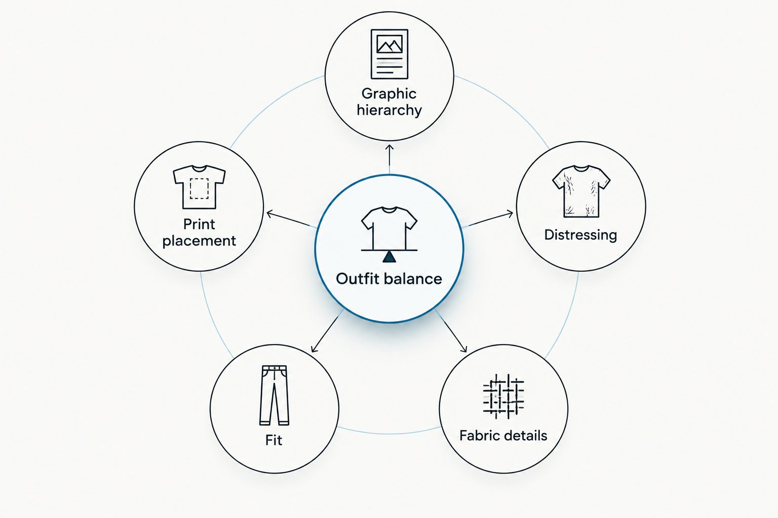
A useful shortlist survives more than a close-up image. Look at the entire garment, then imagine it with your normal trousers and outer layer. If the outfit only works with clothes you do not own, treat that as a separate styling decision rather than a reason to rush the tee.
Bold-print streetwear tees at a glance
This 2026 ranking assigns each graphic treatment a different job. The order favors a clear styling purpose, not a claim about print durability, fabric quality or a particular product.
| Rank and graphic treatment | Best for | Standout detail | Key limitation |
|---|---|---|---|
| 1. Distressed graphics | Worn-in visual character | Broken, faded or interrupted artwork | Fine details can become difficult to read |
| 2. Oversized front prints | An immediate statement | Artwork dominates the front panel | Open layers can interrupt the composition |
| 3. Back graphics | Outfits with a quieter front | Main artwork sits behind the wearer | Outer layers cover the main feature |
| 4. Typography-led graphics | Making wording the focal point | Letterforms carry the design | The message needs to suit you beyond the first impression |
| 5. Multi-placement graphics | Detail across several views | Artwork appears in separate locations | Extra placements require more outfit coordination |
1. Distressed graphics: best for worn-in visual character
Distressed graphics use visual interruption as part of the artwork: faded areas, broken lettering or an uneven-looking image. This describes the design treatment, not the manufacturing process or condition of the garment. A distressed print does not establish that the shirt has holes, raw edges or a particular wash.
Best for: shoppers who want the artwork to feel less pristine. For a 2026 wardrobe built around statement tees, this is the default starting point because the distressing itself supplies a clear visual theme.
Distressed graphics pros
- Interrupted artwork gives you a specific detail to build around.
- A softened-looking design offers an alternative to sharply defined graphics.
- The treatment works as a focal point without requiring extra graphic placements.
Distressed graphics cons
- Small lettering can lose readability within heavily interrupted artwork.
- A distant product image does not reveal whether apparent wear is printed or physical.
Start with plain trousers if you want the graphic to lead. If you prefer distressed denim, compare the two kinds of wear rather than assuming they belong together. Large openings in the jeans and intricate breaks in the print create different visual rhythms.
Inspect the neckline, hem and sleeves separately from the artwork. Choose physical distressing only when you actually want those garment details; do not treat it as a necessary companion to a distressed graphic.
Verdict: Buy this graphic treatment when worn-in artwork is your priority.
2. Oversized front prints: best for an immediate statement
An oversized front print makes the front panel the main event. Here, oversized describes the artwork relative to the shirt, not the garment's fit. You still need to check the shirt's measurements independently.
Best for: outfits where the tee remains visible from the front. Choose this treatment when you want the graphic, rather than your jacket or accessories, to make the first impression.
Oversized front prints pros
- The main artwork is visible without turning around.
- A dominant image gives you an obvious outfit focal point.
- Colors within the print provide references for choosing other pieces.
Oversized front prints cons
- An open jacket can divide the image and obscure its central detail.
- A tucked hem can hide the lower part of a long composition.
Check the image's full boundaries. Artwork extending toward the hem needs a different styling plan from a large graphic concentrated near the chest. Look at where your waistband would sit before planning to tuck the shirt.
Keep the rest of the outfit deliberate, not automatically plain. A patterned trouser can be your choice, but compare it with the print as a complete outfit rather than evaluating each piece separately.
Verdict: Buy this graphic treatment when front-facing impact matters most.
3. Back graphics: best for a quieter front
A back graphic places the main artwork behind you. The front design must be checked separately; a prominent back print does not tell you whether the chest is blank, minimally marked or equally detailed.
Best for: outfits worn without a back-covering outer layer. This treatment lets you prioritize the rear view while choosing how much detail you want at the front.
Back graphics pros
- The rear panel gives the main image its own space.
- Front and back views can serve different styling purposes.
- It suits a deliberate preference for artwork behind the wearer.
Back graphics cons
- A jacket or overshirt covers the main feature.
- Front-only photographs cannot establish the back design's placement.
Build this choice around how you actually dress. If your tee usually stays under a closed jacket, the back graphic will not serve as the outfit's visible statement. Choose it for the occasions when you intend to remove that layer.
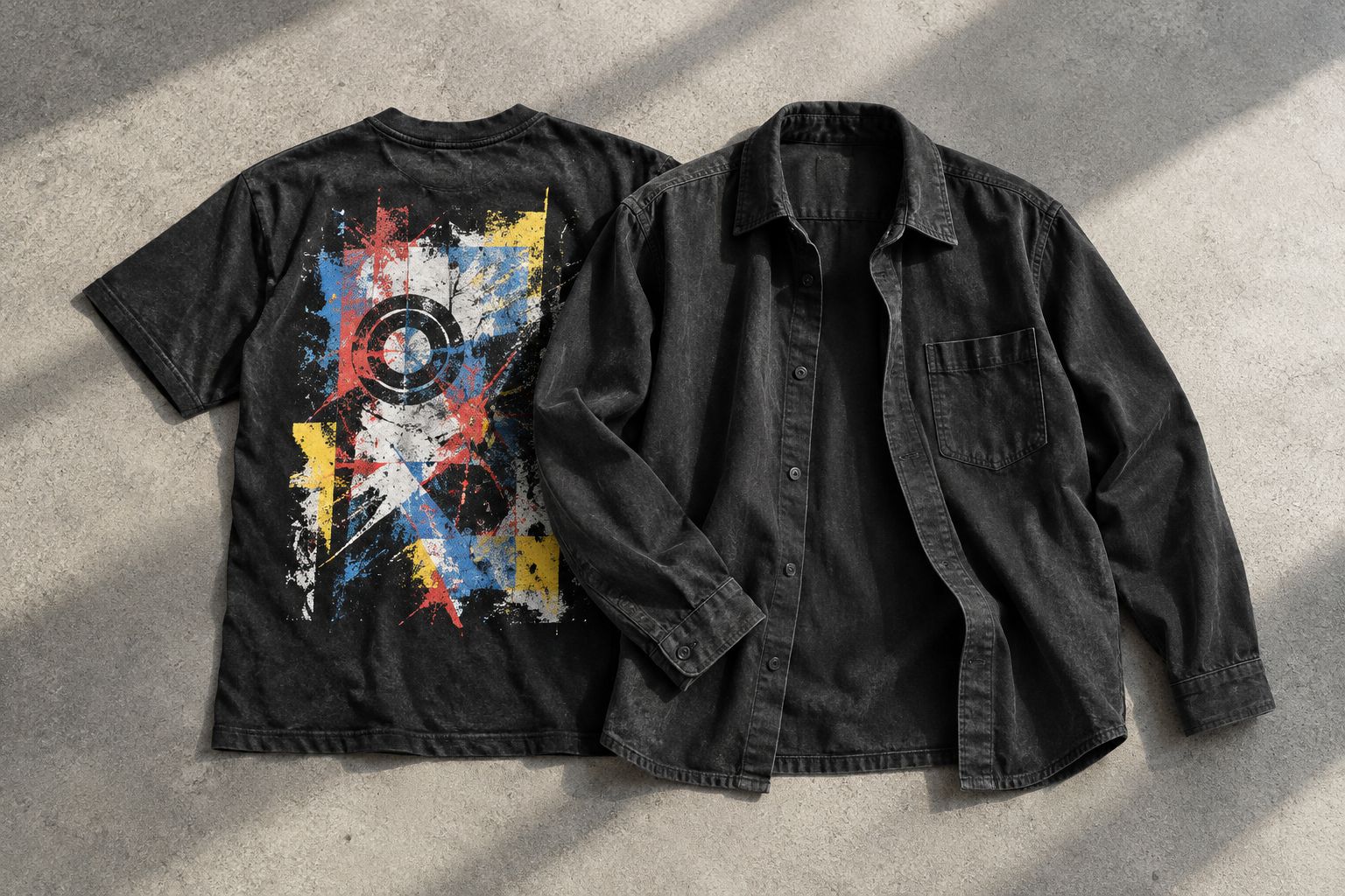
Also consider straps and bags. Judge their position against the artwork rather than assuming every back print remains fully visible when worn. The practical question is simple: will you expose the detail you are choosing?
Verdict: Buy for uncovered-back outfits; skip as a statement piece under outerwear.
4. Typography-led graphics: best for making wording the focal point
Typography-led tees make letters, words or lettering styles central to the design. Read the entire graphic before deciding whether you like it. The appearance of the letterforms and the meaning of the words are separate reasons to choose a shirt.
Best for: shoppers who want the wording itself to be part of the outfit. Your 2026 choice should still make sense to you after the initial attraction to its layout.
Typography-led graphics pros
- Lettering gives the design a defined subject.
- Scale and spacing offer useful details to compare across tees.
- A text-led graphic can carry the outfit without an illustration.
Typography-led graphics cons
- A message you do not identify with remains part of what you wear.
- Distressed or overlapping letters can be difficult to decipher.
Check all visible text, including smaller lines beneath the main phrase and any rear placement. Do not choose a design solely from a cropped image that shows only its largest word.
For styling, decide whether you want the wording read clearly or treated as a visual texture. Neither requires extra accessories. Let the message earn its place before building an outfit around it.
Verdict: Buy when both the wording and the letterforms suit you.
5. Multi-placement graphics: best for detail across several views
Multi-placement graphics distribute artwork across separate parts of a tee. Possible locations include the chest, back and sleeves, but each garment needs its own inspection. Do not infer unseen placements from a single photograph.
Best for: shoppers who want more than one visible graphic location. This is the most coordination-dependent option in the ranking because you are choosing how several details interact.
Multi-placement graphics pros
- Separate placements give you more details to style around.
- Different views can reveal different parts of the design.
- A visible secondary graphic can remain when a layer covers another placement.
Multi-placement graphics cons
- Several graphics can compete with detailed trousers or accessories.
- You need photographs of each placement to assess the whole garment.
Start with the strongest placement and treat the others as supporting details. If every graphic demands equal attention, decide whether that density is the point of the outfit. More artwork is not automatically a better match for your wardrobe.
Verdict: Buy for deliberate all-around detail; skip if you want an easy focal point.
How the graphic treatments are ranked
The ranking follows graphic hierarchy, placement, distressing, fit, fabric details and outfit balance. Distressed graphics take the default slot for worn-in visual character; the other treatments win when you have a more specific placement or messaging preference. These are styling recommendations, not product-test results.
Which bold-print graphic tee should you choose?
Choose distressed graphics if you are undecided. Then narrow the decision by where you want the artwork visible and how the shirt needs to fit your existing outfits.
For Boundus streetwear graphic tees, make a shortlist of 3 outfits: one with your usual trousers, one with your usual outer layer and one without it. Compare the tee against all three before committing to a graphic treatment.
Keep 1 focal point if you want a straightforward outfit. When wearing 2 layers, check which parts of the artwork remain exposed. These are styling exercises, not sizing rules.
FAQ
What's the best graphic tee style for bold streetwear prints?
Distressed graphics are the default recommendation for worn-in visual character. Choose an oversized front print instead when you want the front of the outfit to make the immediate statement.
Does a distressed graphic mean the shirt has holes?
No. Distressed artwork describes a visual treatment, while holes and raw edges are separate garment details. Inspect the photographs and written description for each feature.
Should I size up for an oversized graphic tee?
Choose your size from garment measurements rather than the word oversized. Compare width and length with a tee you already like, and keep print size separate from garment fit.
Is a front graphic better than a back graphic?
A front graphic is better when you want artwork visible from the front; a back graphic suits an exposed rear view. Choose placement around the layers you actually wear.
How do I style a bold tee without making the outfit too busy?
Give the tee the main visual role and assess trousers, footwear and accessories around it. Start with less detailed supporting pieces, then add complexity only if you want it.
What should I check before choosing a Boundus graphic tee?
Check the artwork, visible placements, garment measurements and stated fabric details. Examine distressing in the print separately from any physical distressing in the shirt.
What graphic tee should I choose for 2026?
Choose the graphic treatment that works with your existing outfits rather than choosing by the year alone. Distressed artwork is the default here; placement and fit should settle your final decision.
One last thing
Before choosing, cover part of the product image to approximate your usual jacket opening. Then look again. If the detail you liked disappears, change the placement you are shopping for—not necessarily the rest of your wardrobe.